














When the newsstand collapses, the covers stop selling
It is a Tuesday morning in a grocery lobby. A shopper with a hand basket pauses at the periodical section, glances at a stack of weeklies that has slid into a fan shape, and keeps walking. Nothing is torn, nothing is missing — the display has simply stopped doing the one job that matters in publication retail: presenting covers flat, upright and legible from three metres away. Multiply that small failure by every hour of every trading day, and the loss is no longer cosmetic. It is sell-through.
Magazines, journals and comics are a peculiar retail category. The product is thin, light individually but heavy in bulk, and its entire purchase trigger is visual. A buyer does not search for a title the way they search for a phone charger; they recognise a cover. That recognition depends on the cover facing outward, sitting at a readable height, and staying that way after the fiftieth customer has rifled through the tier.
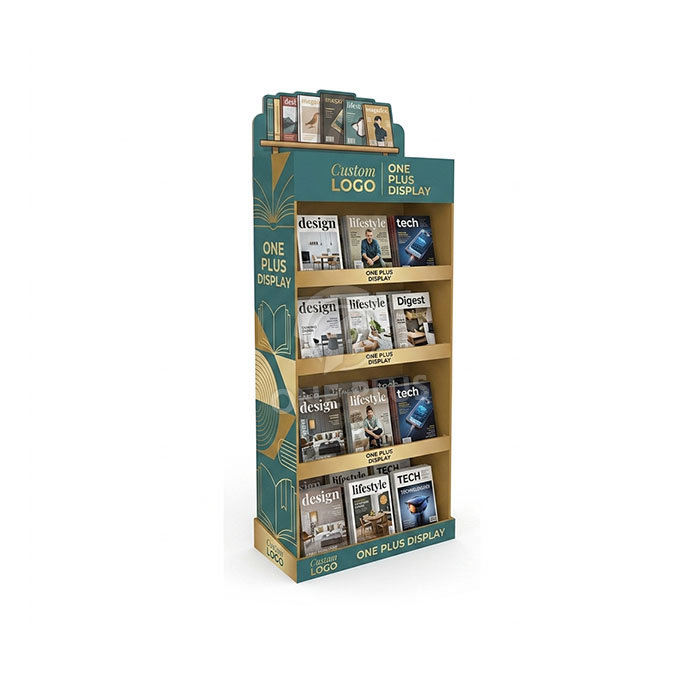
This page is about the floor-standing display unit built for exactly that problem — a multi-tier, front-facing merchandiser in recyclable corrugated board, produced factory-direct and configured around your title mix, cover trim size and store footprint.
Why a floor unit outperforms counter and wall fixtures for print
Publication retail splits roughly into two display philosophies. The first is the counter or rack-top spinner, which works for impulse titles near the till but caps out quickly on capacity. The second is the wall-mounted or gondola shelf, which is efficient but competes directly with the store’s own fixtures for prime sightlines.
A free-standing floor display occupies a third position. It creates its own real estate — a lobby, an aisle end, a queue channel, a trade-show entrance — without asking for wall space or a planogram slot. For print, that independence carries specific advantages:
- Vertical cover staging. Tiers can be stacked so that covers sit at roughly knee, waist, chest and eye height, letting a shopper scan several rows in one downward glance rather than bending or crouching.
- Depth control. A shallow tier keeps the front cover close to the aisle edge. Deep shelves encourage titles to drift backward, where only spines are visible.
- Header real estate. The top panel becomes a brand surface — publisher masthead, campaign line, or a “new issue” call-out — sitting above the merchandise instead of competing with it.
- Relocatable promotion. Seasonal launches, anniversary issues and film tie-ins need a fixture that can be moved to the entrance for a fortnight and then repositioned without a store refit.
For buyers comparing formats, our broader range of напольных стоек из гофрокартона covers the same structural logic across other categories, which is useful when a single retail programme spans more than one product type.
Structural and engineering decisions behind the tiers
A magazine display fails in predictable ways: sagging shelves, splayed side panels, and covers that curl forward over the front edge. Each of those is an engineering decision made long before print.
Shelf partitions and load paths
The tiers are not simple flaps folded out from a single sheet. Each shelf is formed with a front lip and internal partition structure so that vertical load transfers down through the side walls rather than resting on the fold line alone. In practice this means the shelf behaves like a shallow tray with a stiffened front edge — the lip does double duty, retaining the bottom of the cover while resisting the bow that appears when a tier is fully loaded.
Front lips sized to the product
Lip height is one of the few dimensions worth tuning per project. Too shallow and a glossy cover slides forward and tips; too deep and it masks the lower third of the artwork. Because trim sizes vary — digest, standard, oversized art and comics all differ — the lip is specified against your actual title mix rather than a generic default.
Tier count and pitch
More tiers increase capacity but compress the vertical gap between shelves, which reduces how much of each cover is visible. Fewer, deeper tiers read more clearly but hold less. The right answer depends on whether the unit is a browsing fixture (favour visibility, four to five tiers) or a high-volume dump (favour capacity, with tighter pitch and stronger partitions).
Base and stability
Floor units in lobbies and queue channels get nudged, trolleyed into and occasionally leaned on. A wider footprint at the base, combined with internal reinforcing at the bottom of the side walls, keeps the centre of gravity low. The header, being the lightest part of the assembly, should never be the element that decides whether the unit stays upright.
Materials, grades and finishing options
The standard build is corrugated board, chosen because it is light, printable at full coverage, and widely recyclable — a genuine advantage when retail buyers are under pressure to reduce mixed-material fixtures. Board grade is matched to expected load and tier span; heavier print inventories and wider shelves call for a stiffer flute and thicker wall, while lighter catalogues can use a leaner specification.
Finishing is where a print display earns its shelf presence. Options we routinely discuss with buyers include:
| Element | Typical options | Why it matters for print retail |
|---|---|---|
| Класс картона | Single-wall through heavier double-wall corrugated, selected against load and span | Controls sag on loaded tiers and overall rigidity |
| Print coverage | Full-colour litho-laminate or direct print, edge-to-edge | Carries cover-style artwork and header branding without panel gaps |
| Surface finish | Matte, satin or gloss varnish; optional spot gloss on the header | Protects ink in high-touch areas and manages glare under store lighting |
| Edge treatment | Printed fold lines, contrasting edge colour, or concealed flutes | Keeps cut corrugation from reading as unfinished |
| Alternative substrates | PVC foam board for wet or repeated-use environments; acrylic for front lips, dividers or header panels | Adds durability or rigidity where corrugated alone is the wrong answer |
Acrylic is worth isolating as a component rather than a whole-fixture alternative. A clear acrylic front lip, for example, retains covers without hiding artwork, which matters when the cover itself is the advertisement. PVC foam board suits environments where humidity or repeated cleaning would degrade paper-based board — relevant for newsstands near entrances or in food-adjacent locations. Where a programme needs both stiffness and weather tolerance, a comparable approach is used in our PVC floor rack engineering for damp or heavy-duty retail settings.
Merchandising and placement in the store
The fixture only performs if it is put where browsing happens. In practice, magazine floor units earn their keep in four locations:
- Entrance and lobby zones — captures shoppers during the transition into the store, when they are still scanning and unhurried.
- Queue channels — converts dwell time at the till into cover recognition, provided the tiers are angled toward the waiting shopper.
- Aisle ends facing traffic — works when the header is legible from the main walkway and the top tier sits near eye height.
- Event and lobby promotions — launches, subscription drives and publisher tie-ins, where the unit is temporary but still needs to look deliberate.
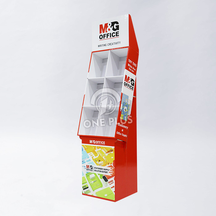
A common mistake is treating the unit as a storage rack. Publication retail rewards a disciplined front-facing rule: one cover forward per title, back issues behind, and a visible signal — a coloured shelf strip, a numbered tier label, a “new this week” tab — so staff can restock without disrupting the display. Where a retail programme includes related impulse categories such as notebooks, pens or greeting products near the same till, a companion fixture built on the same visual system keeps the zone coherent; our stationery and office supplies floor display rack follows that same logic for adjacent product groups.
Customisation and how a project runs
Almost every element is project-specific, but the decisions cluster into a short list. Buyers typically start with the product envelope — tallest and widest title, plus the average thickness of a full tier — and work outward to tier count, lip height, footprint and header size.
A typical workflow looks like this:
- Brief and product samples. Title dimensions, weight per tier, expected units per tier, and where the fixture will stand.
- Structural concept. Tier count, pitch, lip depth, base footprint and header proportions proposed against the brief.
- Artwork integration. Header branding, side panel graphics and any shelf-level labelling mapped onto the dieline so nothing lands on a fold or a glue tab.
- Prototype and fit check. A physical sample is loaded with real stock to confirm covers sit upright and the unit remains stable.
- Production and finishing. Print, die-cut, finish and assembly, with quality checks at the fold and lip areas where failures typically originate.
Colour direction is fully open. The teal-and-gold scheme referenced in the original specification is one example of a publication-appropriate palette — deep enough to feel editorial, warm enough to stand out against white store walls — but the same structure works with a monochrome newsprint aesthetic, a bold comic palette, or a restrained single-colour header. Book-themed line art, masthead typography and cover-style imagery all reproduce well at full coverage.
Three scenarios where this format does real work
1. A supermarket lobby newsstand
A grocery chain wants weekly titles visible from the entrance. Five tiers, moderate pitch, a shallow lip and a low, wide base suit a location where trolleys pass close by. The header carries the retailer’s own magazine branding, and a numbered tier strip lets staff restock by title without reshuffling covers.
2. A publisher’s subscription drive
A publishing house runs a two-week campaign in bookstore foyers. The unit is built around a single flagship title with back issues on lower tiers, an acrylic front lip so no cover artwork is obscured, and a header panel with a scannable call to action. The whole fixture is designed to be assembled and dismantled repeatedly over a multi-city tour.
3. A comic and collectible shop
Comics are lighter but more numerous, and bagged boards need a deeper tier with a firmer divider so issues do not slump sideways. Here the pitch tightens, partitions strengthen, and the header shifts to a bold, high-contrast treatment that reads under mixed shop lighting.
Assembly, packing and getting units to store
Floor displays are shipped flat and assembled on site, which is what makes a nationwide rollout practical. Design decisions that reduce friction at store level include pre-scored folds, clearly marked glue tabs, and a build sequence that one person can complete without tools. A short visual assembly guide printed on the packing carton removes the need for a training visit.
Packing is dimensioned to keep the flat-packed unit compact and to protect the printed surfaces and lip edges in transit. Units are typically palletised in defined quantities per carton, with outer labelling showing SKU, artwork version and store allocation so distribution centres can route them without opening the pack. For buyers running regional rollouts, we can plan carton counts around your DC and store-level intake rather than a single bulk consignment.
Disposal matters too. A predominantly corrugated fixture separates cleanly into the paper recycling stream at end of campaign, which is increasingly a line item in retail sustainability reporting — and a reason PVC or acrylic is reserved for the specific components that genuinely need it.
Frequently asked questions
How much weight can each tier hold?
Load capacity depends on board grade, tier span, partition design and how the weight is distributed. Rather than quoting a single figure, we size the structure against your expected weight per tier — tell us the title weight and units per tier and the specification is built to suit, with a prototype loaded and checked before production.
Can the display be sized for non-standard magazine formats?
Yes. Digest, standard, oversized art titles and bagged comics all have different envelopes. Height, width, tier pitch and lip depth are set against your actual title mix, and the footprint is adjusted to the intended location.
Is corrugated strong enough for a full magazine inventory?
Corrugated is strong enough when the load path is designed properly — reinforced partitions, stiffened front lips and side walls that carry vertical load. For unusually heavy or wide tiers, or for damp environments, we substitute heavier board grades or introduce PVC foam board and acrylic components where they add real value.
What is the minimum order and lead time?
Both depend on structure complexity, print coverage and finishing. Share your brief, artwork status and required in-store date, and we will confirm quantities and scheduling that fit your rollout.
Start your magazine display project
If you have a title mix, a store format and a launch date, you have enough to begin. Send us your cover dimensions, expected units per tier and the location the unit will occupy, and our team will come back with a structural proposal, finishing options and a production schedule. One Plus Display manufactures factory-direct, so structural changes are engineering conversations rather than change orders — and the fixture that arrives in your lobby is the one that was tested with your stock on it.